

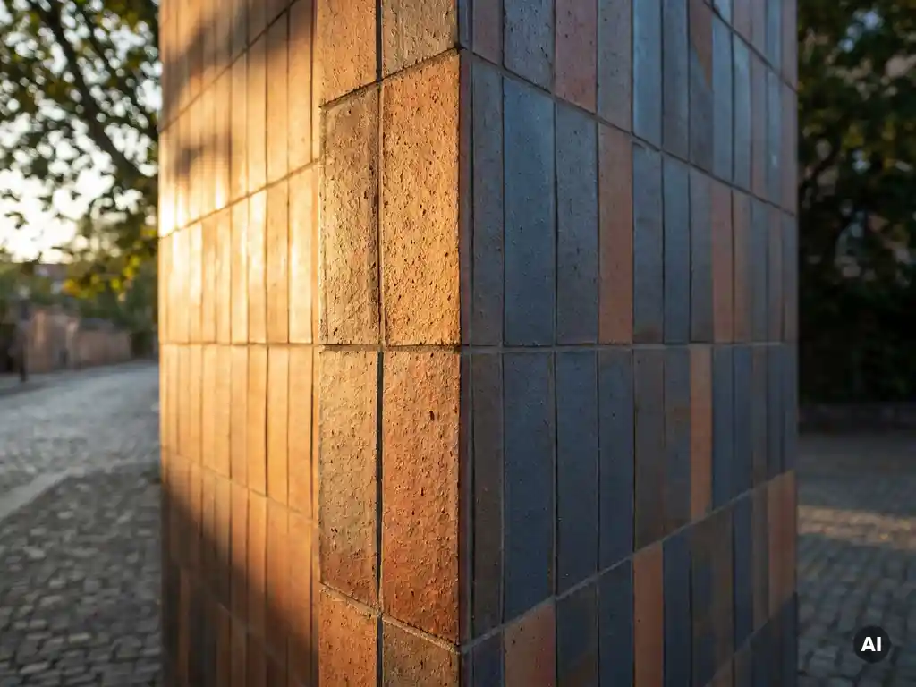
Choosing a terracotta color or texture without accounting for facade orientation is one of the most common mistakes in ceramic facade design. A shade that looks warm and inviting on a south-facing elevation can appear flat and muddy on a north-facing one. A heavily textured surface that adds depth in diffused light might create uncomfortable glare in direct afternoon sun. Getting this right before you specify materials saves time, avoids costly revisions, and produces facades that look exactly as intended for decades to come.
This guide walks you through a practical, step-by-step process for matching your terracotta color and terracotta texture choices to the specific light conditions, weathering exposure, and visual dynamics of each facade elevation. Follow the steps in order, because each one builds on the last.
Map your facade’s orientation and sun exposure
Before you select a single tile, document the sun exposure conditions for every elevation of the building. Facade orientation determines how much direct sunlight each face receives, how long shadows fall across the surface, and how much ultraviolet radiation the material must withstand over its lifetime. These factors vary significantly between elevations, and treating the whole building as one uniform surface leads to mismatched results.
- Identify the compass orientation of each facade elevation: north, south, east, west, or any intermediate bearing.
- Note the peak sun hours for each elevation based on the building’s geographic location and any obstructions such as neighboring structures or tree lines.
- Record whether each elevation faces prevailing wind and rain, as this affects weathering and surface soiling patterns over time.
- Sketch or annotate a simple site plan with this information so you can reference it throughout the selection process.
After completing this step, you should have a clear, documented profile for each elevation. South and west faces will typically show high direct sun exposure; north faces will show consistent diffused light; east faces will have strong morning light but shade by afternoon. This map becomes your reference point for every decision that follows.
Match terracotta colors to light conditions per elevation
With your orientation map in hand, you can now match terracotta color choices to the light behavior of each elevation. Color perception is highly dependent on light intensity and angle. The same terracotta tile can read as a rich, saturated tone in diffused northern light and as a washed-out or overly bright surface in intense direct sunlight.
Use these principles as your starting framework:
- South and west elevations receive the most intense and prolonged direct sunlight. Lighter and mid-range terracotta tones work well here, as they reflect heat and maintain visual balance without appearing bleached. Deeply saturated or very dark tones can feel visually heavy under strong sun and may increase surface temperatures.
- North elevations benefit from warmer, richer terracotta tones. Because diffused light reduces color saturation naturally, a warm amber, deep ochre, or reddish-brown tone will hold its character and prevent the facade from looking cold or grey.
- East elevations experience dramatic morning light followed by shade. Tones with a warm undertone tend to perform well here, as they respond beautifully to low-angle morning sun without becoming harsh later in the day.
Permanent UV resistance is a non-negotiable requirement for any color you select. Ceramic tiles produced through a high-temperature sinter firing process retain their color without fading because the pigmentation is integral to the material itself, not applied as a coating. This means the color you see on day one is the color the building will show for its entire service life, making your initial selection all the more important to get right.
Select surface textures based on glare, shadow, and weathering
Surface texture affects how light interacts with the facade at every hour of the day. A smooth, dense surface reflects light in a consistent, clean manner. A structured or relief texture creates micro-shadows that add visual depth but also influence glare behavior and how dirt and moisture move across the surface over time.
Glare and reflectivity
Evaluate glare risk for each elevation before committing to a texture. South and west elevations in particular can produce uncomfortable glare if a smooth, light-colored surface is combined with intense direct sun. A lightly textured or matte surface scatters light more diffusely, reducing glare without sacrificing the clean appearance that ceramic facades are known for. Explore the full range of available surfaces and formats to understand how different texture profiles perform under varying light conditions.
Shadow play and visual depth
On north or shaded elevations, a more pronounced surface texture can compensate for the lack of direct light by creating its own shadow play. Relief textures and structured surfaces introduce movement and depth that flat, diffused light would otherwise eliminate. On south-facing elevations, the same deep texture can create strong, sometimes distracting shadow lines at midday, so a subtler texture often performs better.
Weathering and maintenance
Consider how each texture handles rain, dust, and biological growth over time. Very open or deeply recessed textures can trap particulates and moisture on elevations exposed to prevailing rain. Smooth, dense ceramic surfaces with low porosity are inherently easier to keep clean through natural rainfall and require minimal intervention. This is a key long-term value consideration: a surface that stays clean and consistent over decades reduces lifecycle maintenance effort significantly.
Adjust format size and joint patterns for orientation-driven visual effects
Format size and joint layout are not purely aesthetic choices. They interact directly with the light conditions you have already mapped, and they can either reinforce or undermine the color and texture decisions you have made so far.
- On elevations with strong raking light (east and west faces in particular), horizontal joint lines are emphasized by shadow. A running bond or horizontal stacking pattern can create pronounced shadow lines that add rhythm. Decide whether this effect suits your design intent before committing.
- On south elevations with high overhead sun, vertical joints receive less shadow emphasis. Larger-format tiles with minimal joint widths produce a cleaner, more uniform surface that reads well in bright, overhead light.
- On north elevations where light is flat and diffused, larger formats can look monotonous. A smaller or medium format with a more active joint pattern introduces visual texture that compensates for the absence of natural shadow variation.
- Consider the building’s scale. Larger formats tend to read better at a distance and on tall elevations, while smaller formats add detail interest at pedestrian level.
Ceramic facade tiles can be produced precisely to within one millimeter, with formats ranging from 150 x 300 mm up to 400 x 1,600 mm. This range gives you genuine flexibility to tune the visual scale of each elevation independently, which is especially useful when different faces of the same building require different treatments.
Validate your selection with physical samples on-site
Every decision made in the previous steps should be validated with physical tile samples viewed on the actual site, on the actual elevation, at different times of day. Digital renderings and studio lighting conditions cannot replicate the way natural light behaves on a specific building in a specific location. This step is where many facade color and texture mismatches are caught before they become permanent.
- Request physical samples in your shortlisted colors and textures. Larger samples give a more accurate impression than small swatches.
- Mount or hold the samples against the facade at the correct elevation and angle, not flat on a table or propped against a wall in a different orientation.
- Observe the samples in morning light, midday light, and late afternoon light on a clear day. If possible, also view them on an overcast day to understand how the colors read in diffused conditions.
- Step back to viewing distances that reflect how the building will actually be experienced: from the street, from across the road, and from close range.
- Compare samples for different elevations side by side to confirm that the overall composition works as a coherent whole, even if individual elevations use different colors or textures.
You can request physical samples to support this on-site validation process. This is the most reliable way to confirm that your facade design will perform visually exactly as intended once installed. If a sample does not look right in context, adjust your selection at this stage rather than after installation.
How TONALITY® supports your facade orientation and tile selection process
Selecting the right ceramic facade system for each orientation requires both material quality and genuine design flexibility. TONALITY® provides both. Here is what makes the difference in practice:
- Wide color and surface range: A broad palette of terracotta colors and surface textures means you can specify different treatments for different elevations without switching suppliers or systems.
- Precise format options: Tiles produced to within one millimeter, in formats from 150 x 300 mm to 400 x 1,600 mm, give you the control to optimize visual scale and joint patterns per elevation.
- Permanent UV and color stability: The sinter firing process at over 1,200 degrees Celsius ensures that color performance remains consistent across all orientations for the full service life of the building, with no fading or coating degradation.
- Low-maintenance lifecycle: Smooth, dense surfaces with integrated graffiti protection and natural self-cleaning behavior through rainfall reduce long-term maintenance effort on all elevations, contributing to a strong total cost of ownership.
- Physical samples for on-site validation: Samples are available to support your site-specific evaluation before final specification.
- Real-world project references: Browse completed facade projects to see how different color and texture combinations perform across orientations in built examples.
Ready to match your facade design to the specific conditions of your project? Get in touch with the TONALITY® team to discuss your elevation requirements and request samples tailored to your design brief.
Related Articles
- How do sustainable building materials impact construction timelines
- Reasons Reuse Will Matter More Than Recycling for Facades by 2030
- Can ceramic cladding solutions be retrofitted onto existing building facades?
- How are terracotta facade panels fixed to a building structure?
- What are the challenges in sustainable design?