

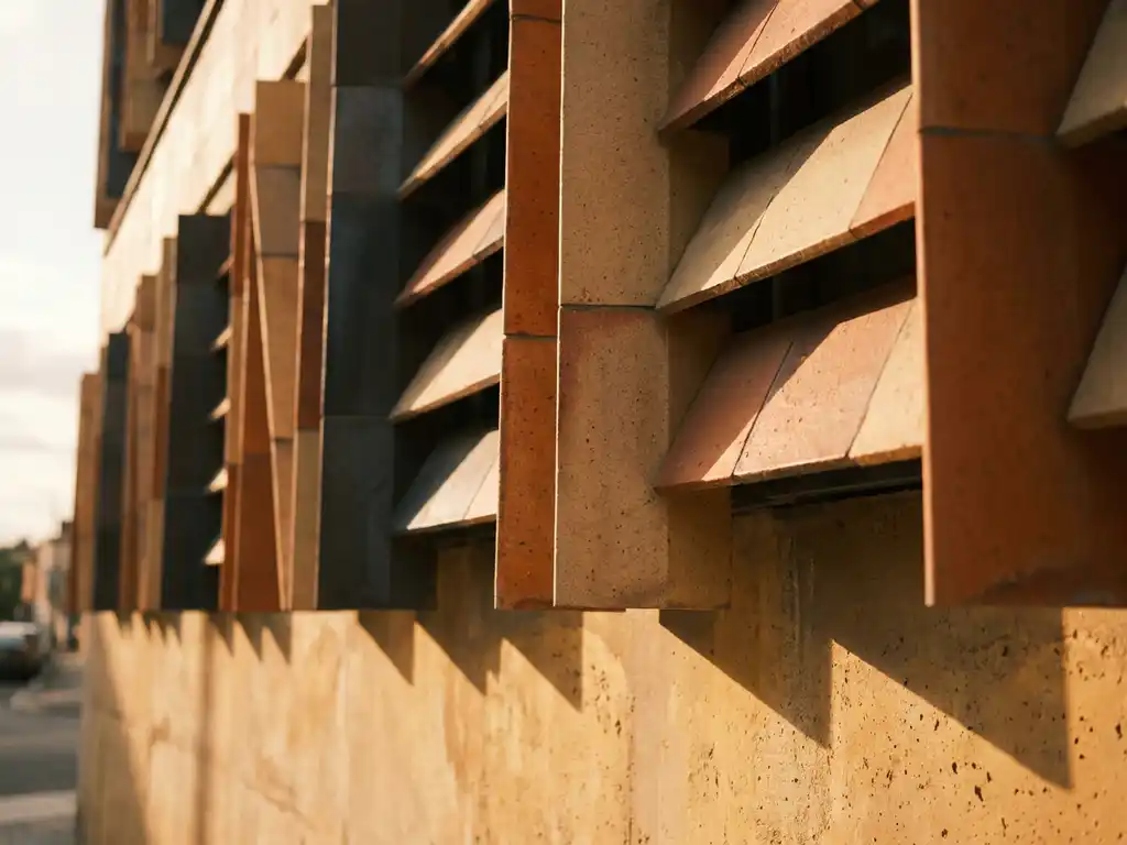
A brise-soleil facade was never meant to be invisible. Originally conceived as a functional response to solar gain, the brise-soleil has evolved into one of architecture’s most expressive tools. Today, the best examples do two things at once: they manage heat, glare, and energy loads with genuine precision, and they give a building a face worth remembering. The six projects below show exactly how that double duty plays out in practice, from urban towers to timber-frame schools, and across a range of materials, geometries, and climates.
When sun shading becomes architectural identity
The shift from purely functional shading to deliberate statement facade design has been one of the defining moves in contemporary architecture. Clients and design teams increasingly recognize that the elements controlling solar access are also the first things a passerby sees. That alignment of performance and identity is what separates a great brise-soleil facade from a bolted-on afterthought.
The six examples collected here span different typologies, materials, and scales. What they share is a refusal to treat sun protection as a secondary concern. Each one treats the shading layer as the primary architectural gesture, and each one demonstrates that the most durable statement facades are also the most technically rigorous ones.
1: The latticed screen that filters light and turns heads
A close-set ceramic lattice wrapping a mixed-use block in a dense urban quarter is one of the most recognizable expressions of brise-soleil architecture. The grid interrupts direct solar radiation across the south and west elevations while creating a constantly shifting pattern of light and shadow on the floors behind it. Viewed from the street, the screen reads as a single coherent surface rather than a collection of individual components.
What makes the lattice format particularly effective is its scalability. The same logic that works on a four-storey residential block translates to a twenty-storey commercial tower without losing resolution. Ceramic elements are well suited to this application because they hold dimensional precision across large installations, ensuring the geometry stays tight even as the facade expands. Tile-to-tile consistency is not cosmetic here; it is structural to the visual effect.
This approach is best suited to high-footfall urban locations where the facade is read at close range as well as from a distance. The lattice rewards both scales of attention, making it a strong choice for cultural buildings, hotels, and mixed-use developments where identity matters as much as performance.
2: Vertical fins that frame the skyline
Vertical ceramic fins projecting from a primary facade plane are among the most direct expressions of facade sun protection. Oriented to intercept low-angle morning or afternoon sun, fins create hard shadow lines that shift across the building face throughout the day, giving the elevation a kinetic quality without any moving parts.
The proportional relationship between fin depth, spacing, and orientation is where the design work happens. Deeper fins provide more aggressive shading but also increase the visual weight of the facade. Narrower spacing intensifies the rhythm. When ceramic is used for the fin material, the surface density and UV stability mean the color and texture hold over decades without the chalking or fading that affects painted metal alternatives.
Vertical fins work particularly well on office buildings and institutional facades where a strong directional reading is desirable. They also integrate naturally with curtain wall systems, allowing the shading layer and the weathering envelope to be coordinated within a single facade strategy. For completed facade projects, the combination of fins and a flat tile background is a recurring approach that balances performance with visual clarity.
3: Perforated panels with a pixelated graphic identity
Perforated ceramic panels take the logic of the lattice and push it toward image-making. By varying the size, density, and distribution of perforations across a facade field, designers can embed graphic content directly into the shading layer. The result is a ceramic facade design that functions as both sunscreen and large-format artwork.
The technical challenge is maintaining structural integrity across panels with high perforation ratios while keeping the shading performance meaningful. Ceramic handles this well because the material’s inherent stiffness allows relatively thin panels to carry significant open area without flexing. The sinter-fired surface also means cut edges remain stable and do not require additional sealing or finishing.
Pixelated graphic facades are a natural fit for cultural institutions, universities, and transport hubs where a strong public identity is part of the brief. They are also increasingly used in residential towers as a way of differentiating individual buildings within large developments. The graphic can reference local history, abstracted landscape, or pure geometry, and the ceramic substrate holds the image with the same fidelity on day one as it does twenty years later.
4: Cantilevered horizontal blades on a timber-frame building
Horizontal blades cantilevering from a timber-frame structure present a specific set of material constraints that make ceramic an unexpectedly strong choice. Timber construction demands low dead loads at the facade, and the single-layer production method used for high-quality ceramic tiles keeps surface weight well below what conventional masonry or thick stone cladding would impose. This allows the substructure to remain slender and the blade geometry to stay precise.
The horizontal blade format is optimized for high solar angles, making it particularly effective on south-facing elevations in temperate climates. Blades spaced to block summer sun while admitting winter light can meaningfully reduce cooling loads without compromising daylighting. When the blade material is ceramic and classified as non-combustible, the assembly also satisfies the fire protection requirements that timber construction brings with it.
This combination of low weight, fire classification A1, and dimensional precision makes ceramic blades on timber frames a technically coherent package rather than a compromise. Schools, residential buildings, and healthcare facilities built to passive or near-passive standards are natural candidates for this approach. The range of surfaces and formats available in ceramic allows the blade profile to be tuned to the building’s scale without switching material systems.
5: A color-gradient screen that shifts with the sun
A color-gradient brise-soleil uses the ceramic palette across a facade field to create a surface that appears to change as the light changes. Tiles in progressively shifting tones, from deep terracotta through buff to near-white, are arranged so that the facade reads differently at dawn, midday, and dusk. The shading geometry is constant; the perceived color is not.
Achieving this effect reliably depends on the color consistency of the individual tiles. Ceramic produced through a controlled sinter-firing process delivers the batch-to-batch stability that a gradient requires. If adjacent tiles in a carefully designed sequence show unexpected variation, the gradient breaks down into noise. The precision of the firing process is therefore not just a quality standard but a design enabler.
Color-gradient screens are well suited to cultural buildings, flagship commercial developments, and any project where the facade is intended to be experienced over time rather than read in a single glance. They reward repeated viewing and create a building that feels different at different hours, which is a meaningful quality in public-facing architecture. Permanent UV resistance ensures the gradient remains legible for the life of the building without scheduled repainting.
6: Recycled-material aesthetics with zero-compromise performance
The sixth approach takes sustainability as its starting point and works outward to aesthetic identity. Facades that foreground their material origins, whether through visible texture, natural color variation, or explicit communication about recyclability, are increasingly in demand as clients align their buildings with broader environmental commitments. The challenge is ensuring that the sustainability narrative is matched by genuine technical performance.
Ceramic facades made from natural clay deposits and fired without synthetic additives carry an inherent material honesty. The color comes from the clay itself, the texture from the forming process, and the surface density from the firing temperature. Nothing is applied or laminated. When the building reaches the end of its service life, the ceramic elements can be deconstructed, sorted by component type, and returned to the material cycle with minimum effort. That is a lifecycle story that holds up to scrutiny.
This approach resonates strongly with institutional clients, public sector developers, and any organization with formal sustainability targets. The aesthetic tends toward the honest and the tactile rather than the high-gloss, which aligns well with educational, civic, and cultural typologies. Zero-compromise performance means the facade still meets all the technical requirements for weather resistance, fire classification, and dimensional stability; sustainability and performance are not traded against each other.
Choosing the right ceramic system for your brise-soleil
The six examples above cover a wide range of geometries, scales, and aesthetic intentions, but they share a common selection logic. The right ceramic brise-soleil system is the one that aligns the shading geometry with the solar analysis, the surface treatment with the long-term maintenance expectation, and the format with the structural constraints of the building.
A few questions sharpen the decision quickly. What is the primary solar exposure, and does it call for horizontal blades, vertical fins, or an omnidirectional screen? What is the structural system, and what dead load can the substructure carry? What is the fire classification requirement, and does the material meet it without additional treatment? What is the expected service life, and how does the maintenance requirement fit within the client’s operational model?
Ceramic answers most of these questions favorably across a wide range of project types. The material’s dimensional precision, surface stability, and non-combustibility make it a technically sound default for sun-shading facade applications. The range of colors, textures, and formats means the design space is genuinely open rather than constrained by material limitations. Long-term value comes not from the upfront specification alone but from the reduced maintenance burden and the retained appearance over decades of exposure.
How TONALITY® helps with brise-soleil facade design
TONALITY® ceramic facade systems are a direct match for the design and performance requirements that brise-soleil applications demand. The combination of precise manufacturing tolerances, a wide format range, and A1 fire classification makes TONALITY® elements suitable for the full spectrum of shading geometries described above, from close-set lattices to cantilevered blades on timber frames.
- Format flexibility: Tiles produced precisely to within one millimeter, ranging from 150 x 300 mm up to 400 x 1,600 mm, allow shading geometry to be tuned to the solar analysis rather than adapted to standard sizes.
- Low surface weight: At approximately 40 kg per square meter, TONALITY® elements place minimal load on substructures, making them well suited to timber construction and retrofit applications.
- Non-combustible classification: Building material class A1 means TONALITY® facades meet fire protection requirements without additional treatment, a critical factor for timber-frame and high-rise projects.
- Permanent UV and color stability: The sinter-fired surface retains its color and texture over the building’s service life, supporting gradient and graphic facade concepts that depend on consistent appearance over time.
- Full recyclability: TONALITY® elements can be deconstructed and sorted by component type at end of life, supporting circular economy commitments without compromising on performance.
- Integrated graffiti protection: The dense, smooth surface resists graffiti without applied coatings, reducing maintenance requirements on publicly accessible facades.
Whether the project calls for a bold color-gradient screen, a precision lattice, or a low-weight blade system on a timber structure, TONALITY® provides the technical foundation and the design range to deliver it. Request samples and technical downloads to begin the material selection process, or explore the full surface and format offer to identify the right starting point for your facade concept.
[cta_contact_form]
The TONALITY® team works directly with architects and facade engineers to develop project-specific solutions. Get in touch with the sales team to discuss your brise-soleil project and find the ceramic system that fits your brief.