

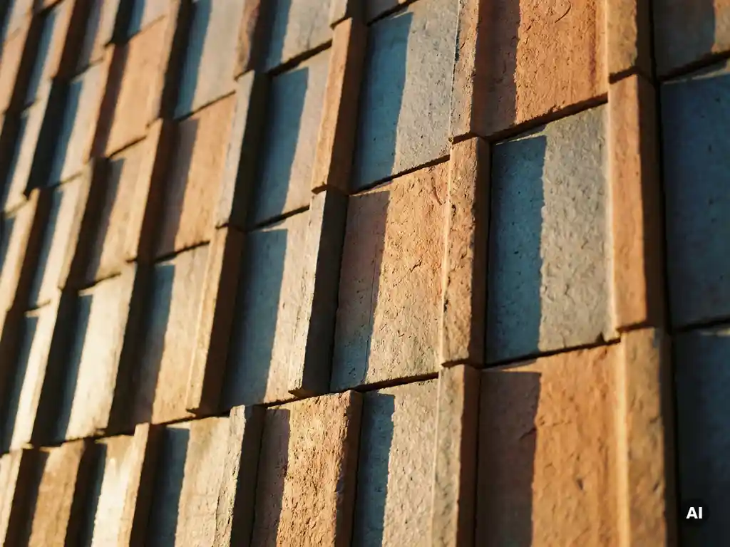
Ceramic facades have long moved beyond flat, uniform cladding. As architects push for facades that communicate character, rhythm, and materiality, profiled ceramic elements have become one of the most versatile tools available. Unlike smooth tiles that reflect light evenly, profiled surfaces interact with daylight dynamically, creating effects that shift throughout the day and across seasons. Whether you are designing a cultural institution, a residential block, or a commercial development, understanding how profile geometry shapes visual outcomes is essential to making informed facade decisions.
What profiled ceramic elements bring to facade design
Profiled ceramic elements introduce a third dimension to the facade plane. Rather than relying solely on color or format to create visual interest, profiles use geometry to manipulate light, shadow, and perception. The result is a facade that reads differently at different times of day, from different distances, and under different weather conditions. This dynamic quality is something no flat tile can replicate, regardless of how refined its glaze or surface finish might be.
The six effects below represent the most architecturally significant outcomes achievable through thoughtful profile selection in ceramic facade design. Each effect has distinct visual logic, and each serves a different design intention.
1: Shadow lines that define depth and rhythm
The most immediate effect of any profile is the shadow line it casts. Even a modest relief of a few millimeters produces a consistent shadow band that runs horizontally or vertically across the facade. These lines create rhythm, breaking up large surfaces into legible units and giving the building a clear visual scale.
Shadow lines are particularly effective on facades with large, undifferentiated surfaces. A repetitive shadow pattern introduces order without complexity, allowing the architecture to feel resolved rather than monotonous. The depth and sharpness of the shadow shift with the sun angle, meaning the facade reads differently at midday than at dusk, adding temporal richness to the design.
This effect works best when the profile direction aligns with the building’s primary compositional logic. Horizontal shadow lines reinforce the floor-by-floor reading of a building; vertical lines emphasize height and slenderness. The choice of profile orientation is therefore not merely aesthetic but structural in its visual impact.
2: Textural contrast against smooth surroundings
When profiled ceramic elements are used alongside smooth cladding materials such as glass, polished metal, or flat render, the textural contrast becomes a primary design driver. The rougher, more tactile quality of a profiled surface draws the eye and establishes a clear material hierarchy across the facade composition.
This contrast is especially useful for articulating different functional zones. A profiled ceramic band at podium level, for instance, creates a grounded, weighty base that anchors a glazed tower above. Alternatively, profiled elements can frame entrances or highlight stairwells, using texture as a wayfinding device without relying on color alone.
The effect is most legible at pedestrian scale, where observers can appreciate the tactile quality of the surface. At a distance, the textural contrast reads as a tonal difference, which means the design intention must hold up at multiple viewing distances to be architecturally successful.
3: Three-dimensional patterns at facade scale
More complex profiles can be arranged to create large-scale three-dimensional patterns that only become fully legible when viewed from a distance. Individual tiles may appear abstract up close, but when the complete facade is seen as a whole, a geometric figure, a woven texture, or a directional field emerges. This scalar play is one of the most sophisticated effects available in ceramic facade tiles.
Achieving this effect requires precise coordination between the tile profile geometry and the installation layout. The pattern logic must be resolved at the design stage, with each tile’s orientation planned as part of a larger compositional system. Ceramic surfaces and formats with consistent dimensional tolerances are essential here, as any variation in size or profile depth disrupts the pattern’s coherence.
This approach suits landmark buildings, cultural institutions, and projects where the facade is intended to function as a public artwork as much as a building skin. It requires close collaboration between architect and manufacturer from the earliest design stages.
4: Color depth amplified by surface relief
A profiled surface does not display color uniformly. The peaks of a relief catch direct light and appear lighter, while the recesses fall into shadow and appear darker. This means a single tile color produces a range of apparent tones across the facade, giving the surface a depth and richness that flat tiles of the same color cannot achieve.
This effect is particularly valuable when working with earth tones, terracottas, and other natural ceramic colors. The inherent variation in fired ceramic already produces subtle tonal differences from tile to tile. When combined with a profiled surface, these natural variations are amplified, resulting in a facade that feels genuinely material rather than applied or decorative.
For architects seeking a monochromatic palette that avoids flatness, profiled elements offer a compelling solution. The color remains consistent as a design choice, but the surface relief ensures the facade retains visual complexity and avoids the sterile uniformity that can undermine an otherwise strong architectural concept.
5: Directional flow guiding the eye across a building
Profile geometry can be used to create a strong directional reading across a facade, guiding the viewer’s eye in a specific direction. Angled or asymmetric profiles catch light differently depending on the viewing angle, creating a sense of movement or flow that animates the building’s surface.
This effect is especially useful for long horizontal facades where the risk of visual monotony is high. A profile that emphasizes horizontal direction reinforces the building’s length and dynamism. Conversely, a vertical emphasis can make a wide building feel more upright and composed. The directional quality also interacts with the building’s surroundings, with light conditions and landscape influencing how strongly the effect reads at different times of year.
Directional flow through profile geometry is a subtle but powerful tool. Unlike color or format changes, it works within a single material language, maintaining material coherence while introducing movement. This makes it well suited to projects where restraint and sophistication are architectural priorities. Exploring completed facade projects can help illustrate how this effect translates from drawing to built reality.
6: Material authenticity referencing natural surfaces
Certain profiles are designed not to create abstract geometric effects but to reference the texture of natural materials such as stone, timber, or riven slate. These profiles use relief to mimic the grain, cleft, or layering of organic surfaces, allowing ceramic to occupy a material register that feels grounded and honest rather than industrial.
This approach aligns well with contemporary interest in biophilic design and the use of natural material references in urban architecture. Ceramic’s inherent connection to earth and fire gives it a material authenticity that synthetic cladding products cannot replicate. When the profile reinforces this connection by echoing natural textures, the result is a facade that feels both contemporary and enduring.
The practical advantages of ceramic are not sacrificed in pursuit of this aesthetic. Fired ceramic remains dimensionally stable, resistant to frost and UV degradation, and free from the maintenance demands of genuine natural stone. The profile delivers the visual character of natural material while the ceramic substrate delivers the performance characteristics that modern construction demands.
Choosing the right profile for your facade concept
Selecting a profile is not simply a matter of picking a texture from a sample board. The right profile choice depends on the building’s scale, orientation, context, and the primary visual effect the design intends to achieve. A profile that works beautifully on a south-facing facade may read very differently on a north-facing elevation where diffuse light conditions flatten shadows and reduce contrast.
Consider the viewing distance at which the facade will most often be experienced. Profiles with fine relief detail reward close inspection but may disappear at a distance. Deeper, bolder profiles maintain their visual impact from further away but can appear heavy or aggressive at pedestrian scale. The relationship between profile depth and tile format also matters: a deep profile on a small tile format can feel restless, while the same profile on a larger format reads as confident and architectural.
Testing profile samples in the actual site conditions, ideally at the correct orientation and in varying light, remains the most reliable way to assess how a profile will perform in context. Requesting physical samples early in the design process allows informed decisions before the specification is finalized.
How TONALITY® supports profiled ceramic facade design
TONALITY® ceramic facades are engineered to deliver all six of the architectural effects described above, with the precision and consistency that demanding facade projects require. The combination of high-quality Westerwald clay, sinter firing at temperatures exceeding 1,200 degrees Celsius, and tight dimensional tolerances down to one millimeter makes TONALITY® elements particularly well suited to profile-driven facade concepts where geometric precision directly affects visual outcomes.
Key advantages that TONALITY® brings to profiled facade design include:
- Consistent profile geometry across large production runs, ensuring shadow lines and patterns remain coherent across the full facade area
- A wide range of formats from 150 x 300 mm up to 400 x 1,600 mm, allowing profile effects to be scaled to the building’s proportional logic
- Building material class A1 certification, meaning non-combustible performance is maintained regardless of profile complexity
- Permanent UV and color resistance, so the tonal effects created by surface relief remain consistent throughout the building’s lifecycle without fading or maintenance intervention
- Integrated graffiti protection and a low surface weight of approximately 40 kilograms per square meter, supporting both long-term performance and structural efficiency
- 100% recyclability, aligning with lifecycle thinking and circular construction principles
TONALITY® works closely with architects and specifiers from the earliest design stages to ensure that profile selection, format choice, and installation system are fully coordinated. Whether you are developing a concept or finalizing a specification, the team can provide technical guidance and physical samples to support your decision-making process.
[cta_contact_form]
To explore the full range of surfaces, profiles, and formats available, or to discuss a specific facade concept, get in touch with the TONALITY® team directly. Bringing the right expertise into the conversation early makes the difference between a facade that performs as designed and one that falls short of its architectural potential.