

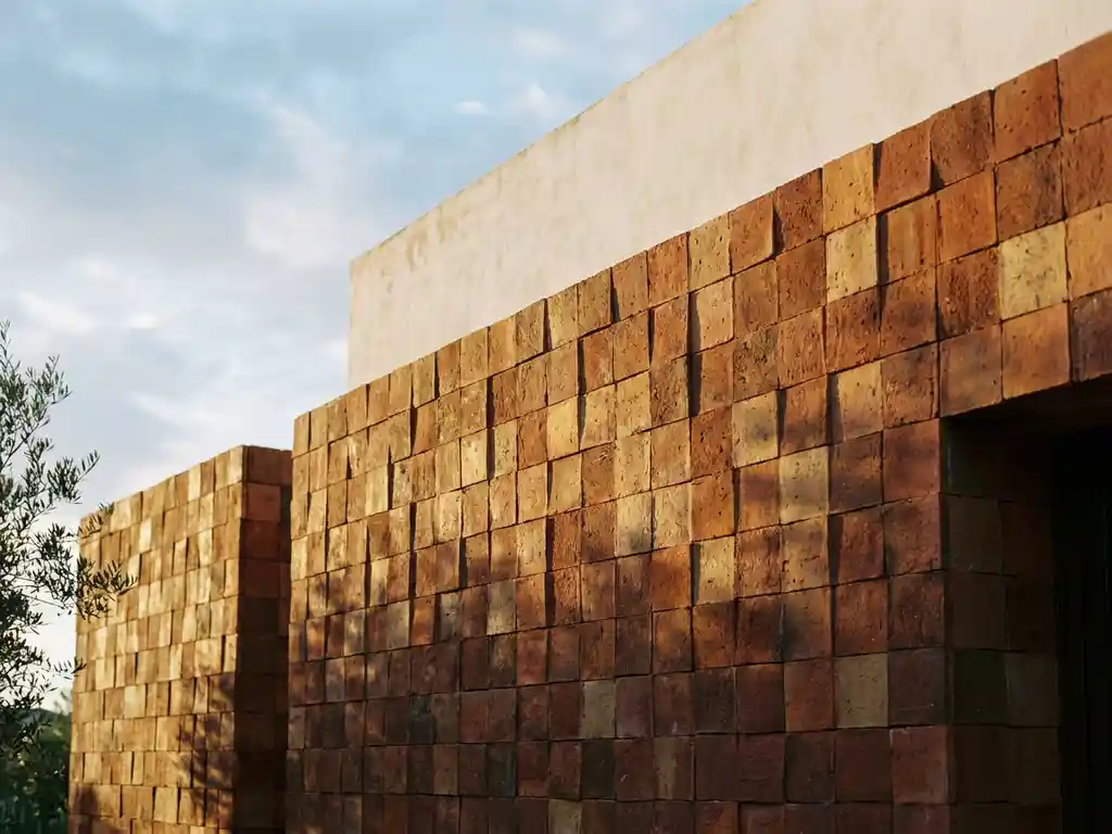
Terracotta is having a defining moment in European architecture. Across residential developments, cultural institutions, and commercial facades, this ancient material has shed its rustic associations and emerged as one of the most sophisticated choices in contemporary building design. What makes terracotta so compelling right now is not just its warmth or its connection to natural materials, it is the sheer range of color expressions it offers. From raw, unfiltered reds to barely-there blush tones, terracotta color palettes are giving architects and designers an extraordinary toolkit for shaping the visual identity of buildings across the continent.
Here are the seven terracotta palettes that are defining European facade design in 2026.
How terracotta became Europe’s architectural statement
Terracotta has been part of European building culture for millennia, but its current resurgence is driven by something new: the intersection of sustainability, material authenticity, and design sophistication. As architects move away from synthetic cladding systems and toward materials with genuine lifecycle credentials, ceramic and terracotta facades have moved to the center of the conversation.
The appeal is not purely aesthetic. Ceramic cladding offers exceptional durability, resistance to weathering, and long-term performance that synthetic alternatives simply cannot match. When a material looks beautiful on day one and continues to perform with minimal maintenance decades later, it earns a permanent place in serious facade design. European architects have taken note, and the results are visible from Lisbon to Copenhagen.
What has changed most dramatically is the palette. Modern ceramic production techniques allow for a range of terracotta color expressions that would have been impossible to achieve consistently even twenty years ago. The seven palettes below represent the tones that are shaping European architecture right now.
1: Classic burnt sienna, the original terracotta
Burnt sienna is the color most people picture when they hear the word terracotta. It is a deep, warm orange-red with earthy undertones that connects immediately to the Mediterranean building traditions of southern Europe. This is not nostalgia, it is a deliberate choice by architects who want their buildings to feel grounded and materially honest.
On a ceramic facade, burnt sienna achieves something that painted or composite surfaces cannot: depth. The color appears to live within the material rather than sitting on top of it, and it shifts subtly with changing light conditions throughout the day. In direct afternoon sun, it glows. In overcast northern European light, it anchors a building with quiet confidence.
Classic burnt sienna works across building typologies but is particularly effective on cultural buildings, educational facilities, and mixed-use developments where a strong material identity is desirable. It pairs well with exposed concrete, weathered steel, and natural timber, making it a versatile foundation for layered facade compositions.
2: Dusty rose, softening the terracotta spectrum
Dusty rose sits at the cooler, lighter end of the terracotta family. It introduces a subtle pink quality to the warm base, creating a tone that feels both contemporary and timelessly elegant. This palette has gained significant traction in residential and hospitality architecture across northern and central Europe, where designers are seeking warmth without the intensity of traditional red-orange terracotta.
The softness of dusty rose makes it particularly effective on large facade surfaces where a more saturated tone might feel overwhelming. It reads as sophisticated rather than sweet, especially when paired with dark metal joinery or natural stone base elements. The palette also performs well in urban contexts, where it introduces warmth into streetscapes dominated by grey concrete and glass.
Dusty rose terracotta is best suited for residential developments, boutique hotels, and cultural venues where a refined, welcoming character is the design goal. It is a palette that photographs beautifully and ages gracefully, making it a strong long-term choice for facade design.
3: Sandy ochre, terracotta meets the desert
Sandy ochre pulls terracotta toward the yellow end of the spectrum, evoking sun-bleached landscapes and arid climates. This palette has found strong resonance in contemporary European architecture as designers draw inspiration from North African and Middle Eastern building traditions, translating them into a northern context with striking results.
The warmth of sandy ochre is more diffuse than classic terracotta. It radiates rather than saturates, giving buildings a luminous quality in bright light and a soft, sandy glow on overcast days. This makes it particularly effective in coastal and southern European contexts, though it has also been used with great success in Scandinavian and German projects where its warmth provides a counterpoint to grey skies.
Sandy ochre works especially well on larger-format ceramic panels, where the subtle tonal variation within the palette can be appreciated across a broad surface. It is an excellent choice for educational campuses, civic buildings, and residential complexes seeking a distinctive but not confrontational visual identity.
4: Smoked clay, the industrial terracotta
Smoked clay is terracotta for the post-industrial city. This palette takes the warm base of traditional terracotta and introduces grey, charcoal, and smoky brown tones that give it a raw, urban edge. The result is a color that feels simultaneously ancient and completely contemporary, perfectly suited to the regeneration projects and mixed-use developments reshaping European cities.
What distinguishes smoked clay from simply grey or brown is its retained warmth. Even at its darkest, this palette avoids the coldness of pure grey cladding. It has an organic quality that reads as a material rather than a finish, which is exactly what architects working in sensitive urban contexts often need. It bridges industrial heritage and contemporary design without forcing a jarring contrast.
Smoked clay ceramic cladding is particularly well suited to former industrial districts, urban residential towers, and commercial buildings in dense city centers. It pairs naturally with exposed brick, raw concrete, and blackened steel, and it holds its character across a wide range of facade scales.
5: Warm greige, where terracotta meets neutral
Warm greige occupies the subtle middle ground between terracotta and neutral. It is neither definitively warm nor cool, neither brown nor grey, it is a tone that works with almost everything, which is precisely why it has become one of the most widely used palettes in European facade design. For projects where the architecture needs to integrate quietly into its context, warm greige delivers without disappearing.
The terracotta influence in warm greige is present but restrained. It prevents the palette from feeling clinical or cold, adding just enough organic warmth to give a building a human quality. On ceramic surfaces, this warmth is enhanced by the material’s natural texture and the subtle tonal variation that fired clay produces, qualities that flat painted or composite surfaces cannot replicate.
Warm greige is the go-to palette for urban infill projects, residential buildings in conservation areas, and commercial developments where contextual sensitivity is paramount. It is also a strong choice for projects that want longevity of appeal, as its neutrality ensures it will not feel dated as design trends evolve.
6: Rustic iron red, raw and unfiltered terracotta
Rustic iron red is terracotta at its most elemental. This palette draws on the deep, iron-rich reds found in natural clay deposits, producing a color that feels genuinely unprocessed, as if the building has been shaped directly from the earth beneath it. It is bold, direct, and completely unapologetic, and it is making a strong statement in European architecture right now.
The depth of rustic iron red means it performs differently from lighter terracotta tones. It absorbs light rather than reflecting it, giving facades a dense, weighty quality that can be used to great effect on buildings that need to assert a strong physical presence. At the same time, the natural variation within this palette prevents it from feeling flat or monolithic, each ceramic element contributes its own subtle character to the overall surface.
Rustic iron red is best suited for civic and cultural buildings, museums, performance venues, and flagship commercial projects where a powerful material statement is part of the design brief. It is a palette with real authority, and in the right hands, it produces facades that are genuinely memorable. You can explore completed facade projects to see how this palette performs across different building types and scales.
7: Blush terracotta, the contemporary residential favorite
Blush terracotta is the palette that has most captured the imagination of residential architects across Europe in recent years. Lighter and warmer than dusty rose, with a distinctly pink-terracotta character, blush has moved from trend to established choice as developers and architects recognize its broad appeal and its ability to create genuinely inviting residential environments.
The success of blush terracotta in residential facade design comes down to its approachability. It signals warmth, comfort, and quality without the formality of darker terracotta tones. On apartment buildings and housing developments, it creates streetscapes that people genuinely want to live in, a quality that is increasingly valued by developers and planning authorities alike.
Blush terracotta performs particularly well in combination with white or light grey window surrounds and balcony elements, which allow the color to breathe without competition. It is also an excellent palette for mixed-tenure residential developments, where it creates visual coherence across different building sections without imposing a single, heavy design statement. For architects and designers exploring this palette, facade samples and material downloads provide a useful starting point for specification decisions.
Choosing the right terracotta palette for your project
Selecting a terracotta color palette is not simply a matter of choosing a favorite tone. The right palette depends on a combination of factors: the building’s context, its function, the scale of the facade surface, the orientation of the building, and the design language of the surrounding streetscape. A palette that works beautifully on a cultural institution in a regeneration district may be completely wrong for a residential infill project in a historic city center.
Consider how the palette will perform across different light conditions. Northern European light is diffuse and often grey, which affects how warm tones read on a facade. Lighter palettes like blush terracotta and sandy ochre tend to perform well in low-light conditions, while deeper tones like rustic iron red and smoked clay need direct light to reveal their full character. Southern European projects have more latitude, but the intensity of Mediterranean light can make very saturated tones feel overwhelming at scale.
Think also about the long-term performance of the palette. Ceramic facade materials maintain their color with exceptional stability over time, but the palette you choose should still feel right in twenty or thirty years. Trend-driven choices can date quickly; palettes rooted in the natural color range of fired clay tend to age with much greater grace. The most enduring facade designs are those where the material and the color feel genuinely connected.
How TONALITY® brings terracotta color palettes to life
TONALITY® is a specialist in high-performance ceramic facades that gives architects and designers direct access to the full terracotta color spectrum, with the material quality and manufacturing precision to make every palette perform at its best. Produced using a sinter firing process at temperatures exceeding 1,200 degrees Celsius, TONALITY® ceramic elements achieve the dense, smooth surfaces that ensure consistent color expression across every panel, every facade, and every project.
Here is what TONALITY® specifically offers for terracotta facade projects:
- Broad terracotta color range: From classic burnt sienna to blush and smoked clay, the TONALITY® palette covers the full spectrum of contemporary terracotta expression with consistent, reproducible results.
- Precision manufacturing: Facade tiles are produced to within one millimeter tolerance, in formats ranging from 150 x 300 mm up to 400 x 1,600 mm, giving designers genuine flexibility in composition and scale.
- Permanent color stability: Integrated UV resistance ensures that terracotta tones remain true over decades, with no fading or surface degradation from weathering.
- Low surface weight: At approximately 40 kilograms per square meter, TONALITY® ceramic elements are particularly well suited to timber construction and projects with substructure constraints.
- Non-combustible material: Classified as building material class A1, TONALITY® ceramic facades contain no combustible components, supporting fire safety requirements across all building types.
- Lifecycle value: Maintenance-free performance, 100% recyclability, and long-term durability make TONALITY® a strong choice for architects and clients focused on total cost of ownership rather than upfront specification costs.
[cta_contact_form]
Whether you are specifying a blush terracotta for a residential development or a smoked clay palette for an urban mixed-use project, TONALITY® provides the material quality and design support to bring your vision to life. Reach out to the TONALITY® team to discuss your project and explore which terracotta palette is right for your facade design.